Detailed guides from basic operations to advanced features.
Visualize team productivity with charts
Repsona visualizes productivity. Our goal is a world where people are recognized fairly for their work and responsibilities. This page explains the Productivity screen.
| Who can use it | Available on |
|---|---|
| All | All |
Productivity screen
Click "Productivity" in the project menu.

Productivity charts show activity for each person.
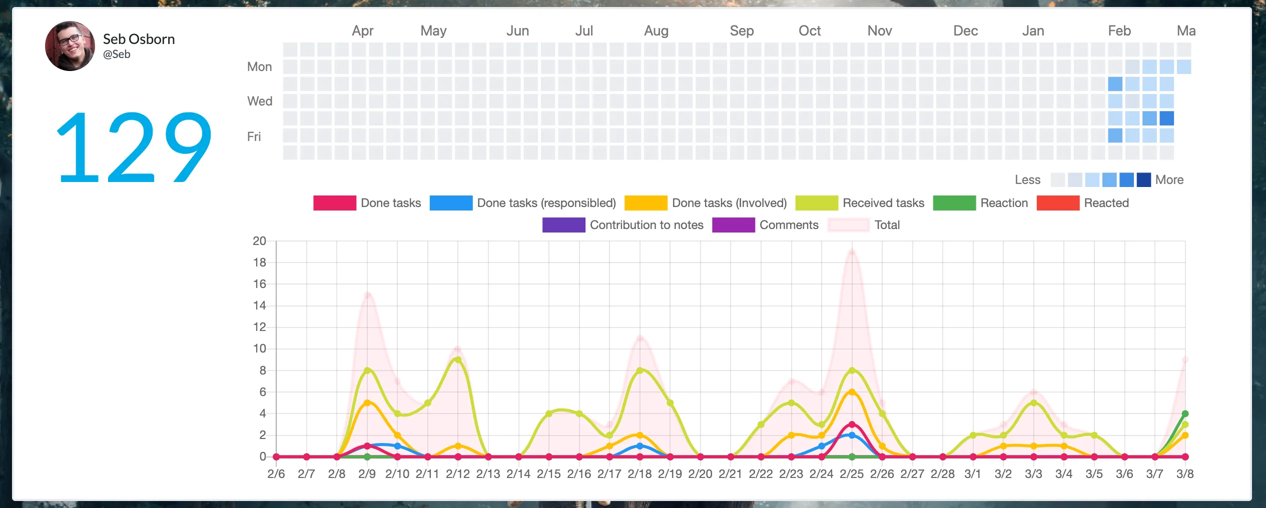
Score
Totals a member’s recent activity into a single score.
Heat map
Days with activity are colored blue; darker means more activity.
Done tasks
Count of tasks this member marked as Done.
Done tasks (responsible)
Count of completed tasks the member was responsible for. For example, if the responsible member reports completion and the project lead sets the task to Done, the count increases here.
Done tasks (involved)
Count of tasks that reached Done where the member held the ball at least once (e.g., temporarily held the ball while the task progressed).
Received tasks
Count of new balls received (work taken on).
Reactions
Number of reactions sent.
Reactions received
Number of reactions received.
Contributions to notes
Number of notes created or updated.
Comments
Number of comments posted.
Total
Sum of the above numbers.
About the score
Repsona’s productivity score is simple. If there’s no movement—no responsibilities taken, no ball received, no contributions to notes, no productive activity—the number won’t increase. Flat charts generally indicate low activity.
However, activity volume alone doesn’t equal impact. For example, many reactions or comments don’t necessarily mean the work advanced. When reviewing productivity and scores, evaluate not only the numbers but also the substance of the activity and the positive reactions received.
Repsona is continuously improving as a people‑centered work management tool. We’ll keep refining these evaluation mechanisms to make them more useful.